Homesick

Crafting 'Homesick': Where Design Meets Wellness
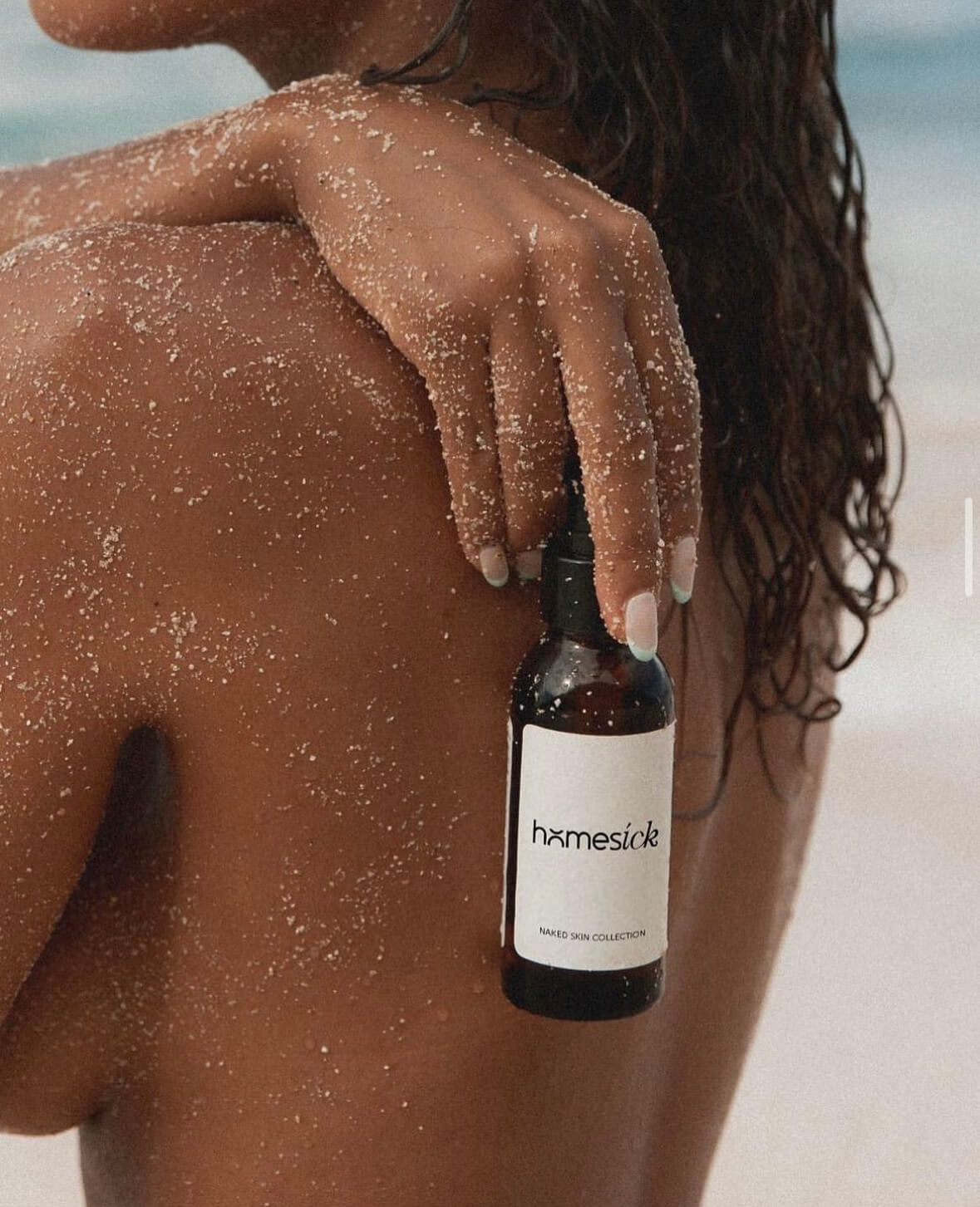
Our latest project, “Homesick,” is a testament to the perfect fusion of artistic design and wellness. We embarked on this creative journey to craft a brand that not only stands out but also speaks to the essence of homely comfort and natural care.
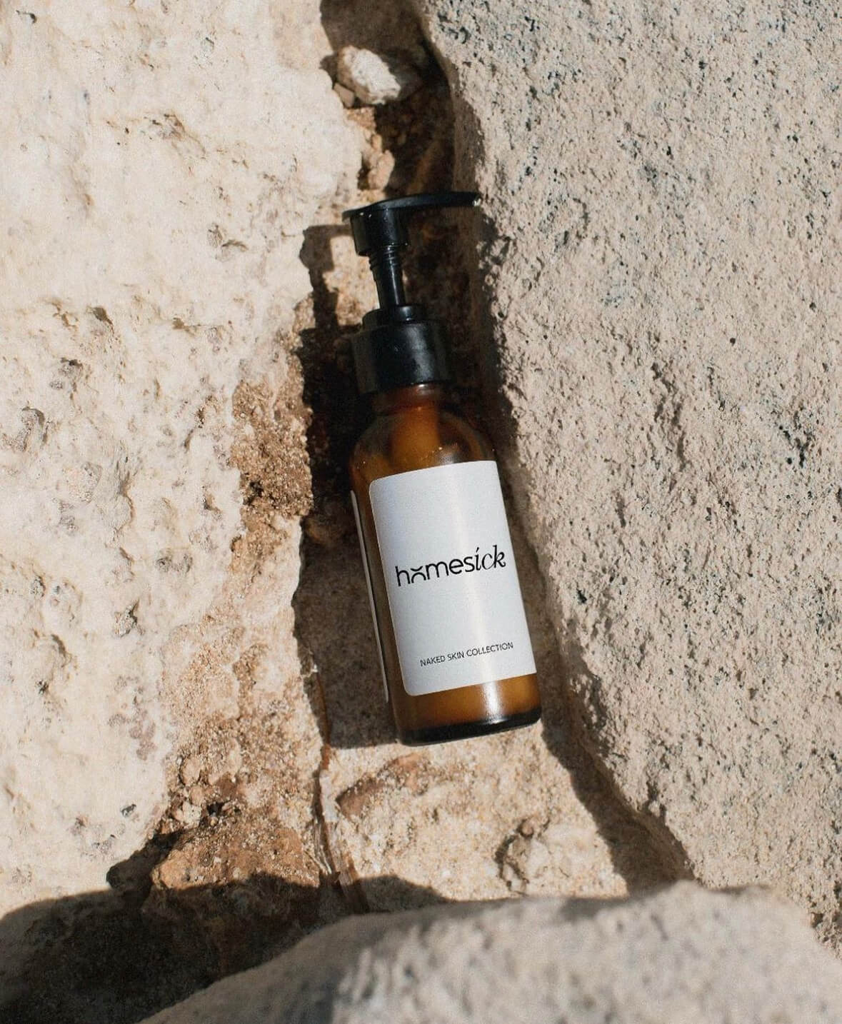
At V Visuals, we meticulously designed a captivating wordmark, seamlessly blending serifs and sans-serifs, adding a touch of italics for that unique twist. The result? A logo that mirrors the brand’s ethos – welcoming, warm, and distinctive.
To complement this splendid wordmark, we handcrafted stunning light and beige renders, meticulously chosen to resonate with “Homesick’s” aesthetic. These renders are not just visuals; they are an embodiment of the brand’s commitment to clean, paraben-free skincare.
- + Brand Development
- + Aesthetics Development
- + Tone of Voice

Visual and typograpy
"In the 'Homesick' project, our creative journey led us to craft a captivating wordmark that seamlessly marries a timeless serif with a modern sans-serif typeface, lending the brand a unique and inviting personality. We didn't stop there; our design process delved deeper into customization, exploring italics and tailor-made adjustments to create a truly distinctive visual identity. To complement this typographical masterpiece, we carefully curated a palette of light and soothing beige hues. These color choices were meticulously selected to resonate with the brand's aesthetic, reflecting its commitment to natural, paraben-free skincare. This holistic approach to design resulted in a visual identity that not only communicates the brand's ethos but also stands as a work of art in its own right

- regular This is text message
- Medium Medium typography
- SemiBold Just Amazing
- Blod Awesome
